Data visualization is the graphical portrayal of any data and information, summarized in a way that it is easy to see identify patterns and exceptions easily. Utilizing visual components like diagrams, charts, and maps are very useful to interpret a data set. In this article we will look into the functions of Octave/Matlab for producing different visual components from a given set of data. Like the earlier articles, we encourage readers planning to learn octave/Matlab to try the exercises marked as “Ex“
“A picture is worth a thousand words“
an English language adage
Figure, Plot and Graph
A figure is a window on screen. One can have window one, window two etc. Each figure is the name, figure one figure two and so on.
>> fig1 = figure();
>> get (fig1, "type");
ans = figure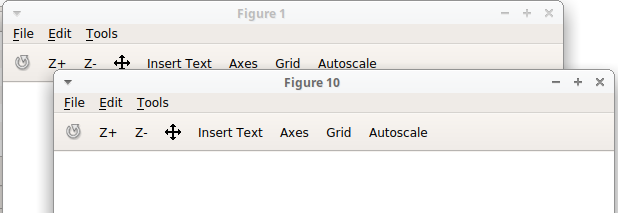
The graphics functions use pointers, which are of class graphics_handle, in order to address the data structures which control visual display. If no value is passed as parameter, opened window is numbered sequentially, else figure number is numbered as per entered integer value.
>>fig2 = figure(10);Ex: run help figure to know more about other input parameters, that are supported with the function.
A plot generally has axis in which unit and the interval can be defined. When figure function is called, It opens a window with one plot area by default. Although Octave and Matlab provides function to have multiple plot area in one figure using subplot function. subplot(m,n,p) divides the current figure into an m-by-n grid and creates axes in the position specified by p. E.g. subplot(2,2,1) creates 2 by 2 grid and places a plot area in top left corner. Position count varies from left to right in a row and then moves to second row. Similarly when subplot(2,2,3) is called, plot area is created at bottom left.
So in a plot then we can draw graphics which are representation of the data. There is no limitation on how many curves can be drawn in a plot area. Also both 2 dimensional and three dimensional curves are possible to be plotted. Before we start plotting different types of curves for data representation let us discuss some important properties to make any curve meaningful.
Axes
Axes are very important to understand a curve and its properties.
Limit
We want our curves to be visible so first we have to set proper limit on axes. If not set Octave/Matlab by default selects a range which should be large enough to show complete curve. But this becomes important when it is required to do one-on-one comparison of multiple plots.
>>xlim([lowValue highValue]);
>>ylim([lowValue highValue]);
>>zlim([lowValue highValue]);
Label
We also need to name the axes so that co-relation in data can be understood.
>>xlabel("String to be entered as name of x axis")
>>ylabel(["Variables can also be included in label as" num2str(Variable)])
>>zlabel("z axis (units)")
Text
Some time annotating a graph is necessary to present additional data to user.
>>text(x_co-ordinate, y_co-ordinate, "String Annotation");Title
Setting the correct title helps in identifying plot at later stage. It also makes clear what the plotted curve means.
>>title("Title String");Legend
Legends are Identifiers, when multiple curves are plotted in one plot area. for example when two curves are plotted, legend for each curve can be specified as:
>>legend("Legend1", "Legend2");Grid
Grid are vertical and horizontal lines which makes a mesh. It helps in identifying a data point easily. It can be turned on and off as required.
>>grid on;
>>grid off;
>>grid minor on;
>>grid minor off;
Hold
When it is required to plot multiple curves in one plot area, hold command is required. It holds the previous curve while new curve is being plotted upon it. Once all curves are plotted, hold command can be used again with off parameter.
>>hold on;
>> % functions to plot curves
>>hold off;
Saveas / Savefig
Once the data is visualized with help of different types of plots, it is important to save data for future reference.
>>saveas(fig, 'figurename.png');
>>savefig(fig, 'figurename.fig', "compact");
In above code example, fig is the graphics handler of opened figure. saveas supports multiple output file format. savefig saves figure in Matlab native format. It can be useful in cases where some manipulation in output parameters (axis, title, etc.) might be required. opened figure has multiple adjustment capabilities.
Ex: use help function to dig deeper into different uses of parameters for functions/commands discussed above.
2-D data visualization
Hands-on work provides much confidence then reading through theory. Although it is always better to read official documentation for multiple use cases and stay up-to date. In this section we will look into multiple type of common plots along with script example. Before looking into each plot-type separately it is wise to know about markers.
Marker
Marker is the point in data series which denotes the relation between x and y axis. For better visualization of data it is better to keep tab of different styles that can be used with marker. Example use of marker is presented with plot scripts.
Line Style
‘–’ Use solid lines (default).
‘– –’ Use dashed lines.
‘:’ Use dotted lines.
‘-.’ Use dash-dotted lines.
Marker Style
‘+’ cross-hair
‘o’ circle
‘*’ star
‘.’ point
‘x’ cross
‘s’ square
‘d’ diamond
‘^’ upward-facing triangle
‘v’ downward-facing triangle
‘>’ right-facing triangle
‘<’ left-facing triangle
‘p’ pentagram
‘h’ hexagram
Marker Color
‘k’ black
‘r’ Red
‘g’ Green
‘b’ Blue
‘y’ Yellow
‘m’ Magenta
‘c’ Cyan
‘w’ White
Line Plot
A line plot or line diagram or line graph is a plot, which shows data as a progression of data points called ‘markers’ associated by straight line fragments. It is mot commonly used diagram in numerous fields. Example script presented here draws two line plots in one axis space.
x = linspace(0,10, 100);
y1 = sin(x);
y2 = cos(x);
fig = figure();
hold on;
plot(x,y1, 'r--o');
plot(x,y2, 'b-d');
legend("sinusoidal plot", "cosine plot");
title("Line Plot");
hold off;
Download Script as .m file from GitHub.

Scatter Plot
A scatter plot or scatter-gram is a numerical graph utilizing Cartesian directions to show values for typically two variables for a set of data. Example script provided here draws the 4 subplots in a row along with adjusting the size of display and output (for saving image). Four subplot are showing different parameters of scatter plot.
disppos = [10 40 1000 200]; %display position on screen[left, bottom, width, height]
fig = figure('Position', disppos);
x = rand(1,100);
y = rand(1,100);
subplot(1,4,1);
scatter(x, y); % no extra input parameters
title("Simple Scatter Plot");
subplot(1,4,2);
scatter(x,y,50); % marker size
title("marker size defined");
subplot(1,4,3);
scatter(x,y,50, 'r'); % marker color
title("marker color red");
subplot(1,4,4);
scatter(x,y,50, 'r', 's'); % marker color
title("marker style square");
set(fig, 'paperunits', 'inches', 'paperPosition', [0 0 10 2]); %set the units and paper size for output.
Download Script as .m file from GitHub.

Bar Plot
A bar plot or bar diagram or bar chart is a chart that presents all out information with rectangular bars with lengths relative to the presented data value. Presented example script plots a simple random normal distribution on a bar chart.
x = linspace(0,10, 100);
y = abs(randn(1,100));
fig = figure();
hold on;
bar(x,y, 'r');
legend("random normal distribution plot");
title("Bar Plot");
Download Script as .m file from GitHub.

Histogram
A histogram or hist plot is an approximate representation of the distribution of numerical or categorical data. Given data is segregated in bins and their occurrence is plotted against bin. Octave has not yet implemented the Matlab’s histogram function so we will use hist function.
x = randn(1,100000);
fig = figure();
hist(x, 100); %data, number of bins
xlabel("data bins");
ylabel("Occurance");
title("Hist Plot Example");
Download Script as .m file from GitHub.

Heat Map
A heat map is a data visualization technique that shows magnitude of a phenomenon as color in two dimensions. Heat map is representation of three dimensional data in 2 dimensional space. In this method all data is normalized and mapped to predefined colormap which gives user que about how data is clustered. heatmap function is not implemented in Octave so we will use imagesc function along with colorbar. A color-bar displays the current color-map along with numerical rulings so that the color scale can be interpreted.
Color map can be set to different color schemes (listed below). if not defined, functions requiring color map (imagesc, contour, mesh, surf, etc.) falls to default.
viridis: default
jet: colormap traversing blue, cyan, green, yellow, red.
cubehelix: colormap traversing black, blue, green, red, white with increasing intensity.
hsv: cyclic colormap traversing Hue, Saturation, Value space.
rainbow: colormap traversing red, yellow, blue, green, violet.
hot: colormap traversing black, red, orange, yellow, white.
cool: colormap traversing cyan, purple, magenta.
spring: colormap traversing magenta to yellow.
summer: colormap traversing green to yellow.
autumn: colormap traversing red, orange, yellow.
winter: colormap traversing blue to green.
gray: colormap traversing black to white in shades of gray.
bone: colormap traversing black, gray-blue, white.
copper: colormap traversing black to light copper.
pink: colormap traversing black, gray-pink, white.
ocean: colormap traversing black, dark-blue, white.
colorcube: equally spaced colors in RGB color space.
flag: cyclic 4-color map of red, white, blue, black.
lines: cyclic colormap with colors from axes “ColorOrder” property.
prism: cyclic 6-color map of red, orange, yellow, green, blue, violet.
white: all white colormap (no colors).
x = linspace(-10,10,1000); % 1-by-1000
y = linspace(10,-10,1000); % 1-by-1000
z = sin(x)' * cos(y); % 1000-by-1000
fig = figure();
imagesc(x,y,z);
xlabel("x");
ylabel("y");
title("sin (x)' * cos(y)");
colorbar();
Download Script as .m file from GitHub.

Contour
Contour is an outline representing or bounding the shape or form of data magnitude.
x = linspace(-3.2,3.2,1000); % 1-by-1000
y = linspace(3.2,-3.2,1000); % 1-by-1000
z = sin (x)' * cos(y); % 1000-by-1000
fig = figure();
colormap("rainbow");
subplot(2,2,1);
contour(x,y,z);
title("Default");
subplot(2,2,2);
contour(x,y,z,20); % iso lines 20
title("20 ISO lines");
subplot(2,2,3);
contour(x,y,z, 50);
title("50 ISO lines");
subplot(2,2,4);
contour(x,y,z,100);
title("100 ISO lines");
Download Script as .m file from GitHub.

3-D data visualization
Sometime it is more easy to understand the data trend when plotted in 3 dimensional space.
3-D Line Plot
Three dimensional line plot is similar to line plot discussed in 2-D data visualization (above). Only difference is that it varies in 3 dimensional space.
x = linspace(1,20,200);
y = sin(x);
z = cos(x);
fig = figure();
plot3(y,z,x); % 3 dimentioanl plotting
xlabel("sin(x)");
ylabel("cos(x)");
zlabel("x");
grid on;
grid minor on;
title("plot3 example");
Download Script as .m file from GitHub.

Mesh plot
Mesh Plot is a three-dimensional surface that has solid edge colors but no face colors (like wire mesh).
x = linspace(-1,1,100); % 1-by-100
y = linspace(-1,1,100); % 1-by-100
z = sin(x)'*cos(y); % 100-by-100
fig = figure();
mesh(x,y,z);
xlabel("x value");
ylabel("y value");
zlabel("z value");
title("Mesh Plot Example");
Download Script as .m file from GitHub.

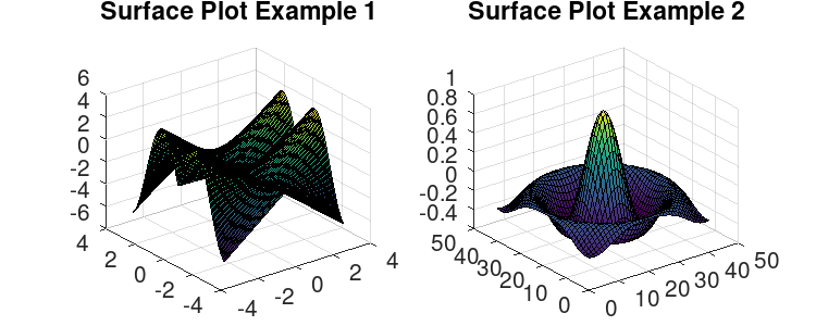
Surface plot
A surface plot is a three-dimensional surface that has solid edge colors and solid face colors.
x = linspace(-3.2,3.2,100); % 1-by-100
y = linspace(3.2,-3.2,100); % 1-by-100
z1 = sin (sqrt (x.^2 + y.^2))' * (sqrt (x.^2 + y.^2)); % 100-by-100
z2 = sombrero();
disppos = [10 40 600 200]; %display position on screen[left, bottom, width, height]
fig = figure('Position', disppos);
subplot(1, 2, 1);
surf(x,y,z1);
title("Surface Plot Example 1");
subplot(1, 2, 2);
surf(z2);
title("Surface Plot Example 2");
set(fig, 'paperunits', 'inches', 'paperPosition', [0 0 5 2]); %set the units and paper size for output.
Download Script as .m file from GitHub.
Ex: Read official documentation of different plotting functions to know more about input parameters.
In this article we have looked only in basic plotting operations. Readers are encouraged to look into documentation for more details. Let us know your query and questions in comment section.
- GNU Octave – Scientific Programming Language
- Octave:1> Getting Started
- Octave:1> Variables and Constants
- Octave:1> Expressions and operators
- Octave:1> Built-In Functions, Commands, and Package
- Octave:2> Vectors and Matrices Basics
- Octave:2> Scripts and Algorithm
- Octave:2> Conditional Execution
- Octave:2> Functions
- Octave:3> File Operations
- Octave:3> Data Visualization